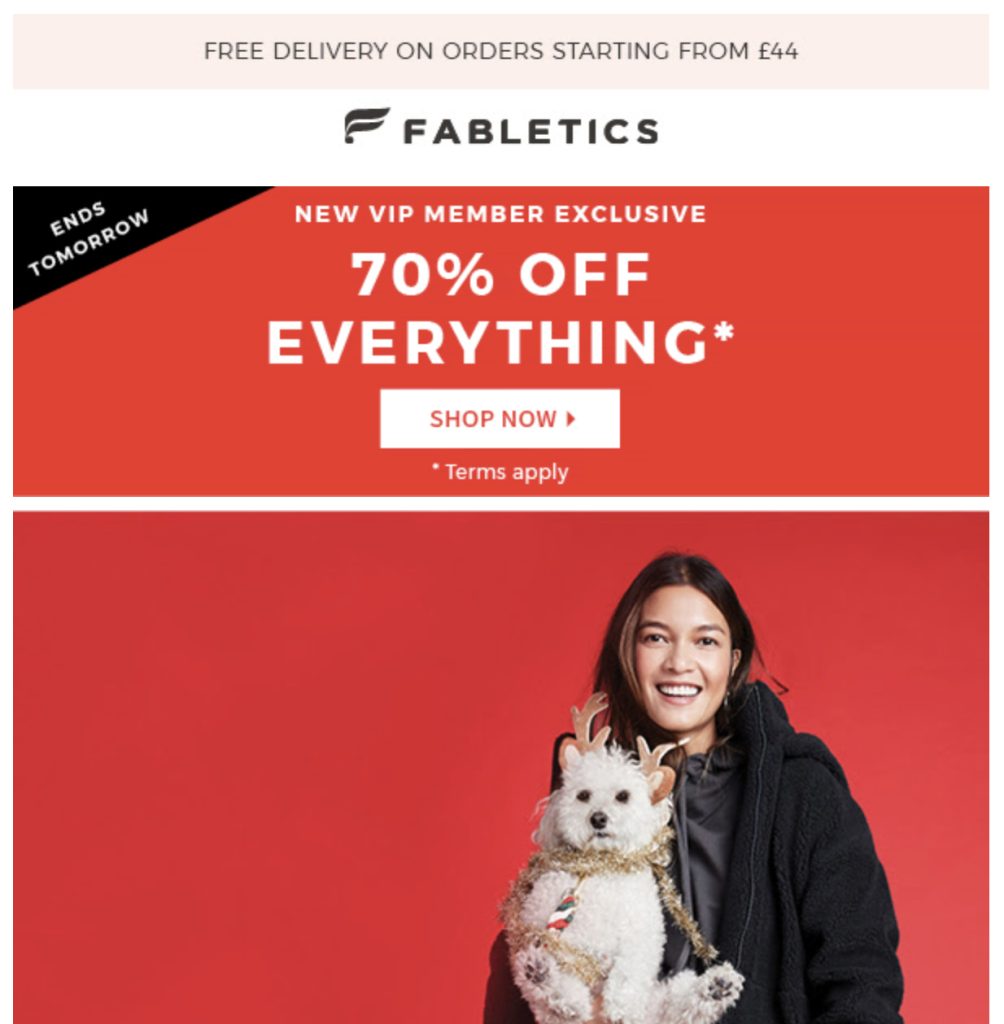
A well-crafted call-to-action (CTA) button can be the difference between a successful email campaign and one that misses the mark. The right design choices—color, size, placement—can turn a passive reader into an engaged customer with a single click.
But what makes a CTA compelling? In this article, we’ll break down the essential design tips that email marketers need to know in order to create CTAs that not only stand out, but also drive action.
Whether you’re new to email marketing or looking to refine your approach, understanding the nuances of CTA design can have a significant impact on your click-through rates.
From choosing the right colors to optimizing placement, these insights will help you create buttons that convert.
Ready to make your CTAs irresistible? Let’s dive in!
TABLE OF CONTENTS
– What is a Call-to-Action (CTA)?
– Why should I use a CTA button?
– 5 call-to-action design tips
– Conclusions
What is a Call-to-Action (CTA)?
A call-to-action (CTA) is a button or link designed to encourage readers to take a specific action, such as clicking to learn more or make a purchase.
Think about the emails you receive from your favourite brands – the ones that grab your attention often include stunning images and compelling copy.
But at the heart of these emails is a well-placed CTA that takes you to the next step. Whether it’s a button that says “Shop now” or “Start my trial”, CTAs are the key elements that lead your audience to your desired outcome.

Why should I use a CTA button?
Using a CTA button is one of the most effective ways to increase conversions and improve metrics. Unlike simple text links, buttons are visually appealing and stand out in an email.
This eye-catching quality makes them a powerful tool for encouraging clicks. In fact, a Hubspot report show that a button-based CTA can increase click-through rates by up to 28% compared to link-based CTAs.
By including buttons in your emails, you create a clear, concise path for your audience to follow, making it easier for them to engage with your content and take action.
5 call-to-action design tips
In our previous article “5 CTA tips to drive more clicks in your email campaigns“, we shared 5 essential call-to-action copy tips to help increase engagement.
Now, we’ve shifted our focus to the design aspect, providing you with 5 key CTA design tips to improve your email performance.
1. Use bright colours
The colour of your CTA button plays an important role in attracting attention. Choose bright, eye-catching colours such as green or orange, which are known to perform well. However, the best choice will depend on your brand’s colour palette.
Always use a contrasting colour to ensure your CTA stands out from the background of your email.
If you’re not sure which colour works best, consider A/B testing different options to see what resonates with your audience.

2. Add white space
White space around your CTA is more than just a design preference – it is a powerful tool for directing focus.
Including plenty of white space around your button helps it ‘pop’ off the page, drawing the reader’s eye exactly where you want it.
This strategy is especially effective for mobile users, providing a clean and clickable area that’s easy to tap. By creating a visual break, white space ensures that your CTA doesn’t get lost in the clutter of your email content.
3. Keep it above the fold
Placing your CTA above the fold – where it’s visible without scrolling – is essential for capturing immediate attention. This placement increases the likelihood that your audience will notice and interact with your CTA right away.
Since important information, such as your main message or offer, should always be front and centre, placing your CTA above the fold ensures that it won’t be overlooked.
4. Watch your hierarchy
In emails with multiple links, images or buttons, it’s important to maintain a clear hierarchy. Your primary CTA should be the most prominent element, directing the reader’s attention to where it matters most.
To avoid distractions, consider using greyscale or matching colours for any secondary CTAs.
Remember, less is more – fewer choices lead to better focus on your main action button.

5. Follow a natural progression
The natural flow of reading – top to bottom, left to right – should guide the placement of your CTA.
Placing your CTA at the bottom or right-hand side of the content can lead to better performance, as it aligns with how users process information.
For example, placing a “Register Now” button after a detailed description of your event makes sense and encourages users to take action after they’ve absorbed the key details.
Avoid placing CTAs where users have to backtrack, as this can disrupt the flow and reduce the likelihood of click-through.
Conclusions
Creating the perfect call to action (CTA) is as much an art as it is a science. While these design tips provide a solid foundation, the real key to success lies in testing.
A/B testing allows you to discover what resonates best with your audience, and even small tweaks can lead to significant improvements in click-through rates.
Remember, there’s no one-size-fits-all solution – continually testing and refining your CTAs will help you stay ahead of the curve and maximise your email marketing results.
If you want a tool that will build a lead database and contact them from unlimited mailboxes, fill out the form and try Outbound Rocks for free.
