
Creating an irresistible call-to-action (CTA) is key to driving engagement in your email campaigns.
A well-crafted CTA will not only grab your audience’s attention, but will also guide them to take the desired action, whether it’s making a purchase, signing up for a webinar or downloading a resource.
In this article, we’ll look at 5 actionable tips to help you optimise your CTAs and significantly increase your click-through rates.
Read on for practical insights to improve your campaigns and get better results
TABLE OF CONTENTS
– What is a call-to-action?
– The importance of CTA placement in emails
– Increase email clicks: 5 CTA tips you need
– Conclusions
What is a call to action?
A call-to-action (CTA) is a request within your content that encourages your audience to take a specific action.
In email marketing, a CTA typically appears as a button or link that directs recipients to perform an action such as ‘buy now’, ‘download’ or ‘sign up’.
The primary goal of a CTA is to guide the user to complete a conversion, whether it’s making a purchase, filling out a form or accessing additional content.
A well-crafted CTA is clear, compelling and aligned with the overall goal of your campaign, encouraging users to engage more meaningfully with your brand.
The importance of CTA placement in emails
A strategically placed CTA ensures that it catches the reader’s attention at the right time, increasing the likelihood of a click.
Typically, placing the CTA above the fold – at the top of the email, visible without scrolling – ensures immediate visibility. However, depending on the length and content of your email, additional CTAs can be placed in the middle or at the end to reinforce the message.
The context of the CTA is also important. It should be placed where it naturally follows the flow of the content, making it a logical next step for the reader.
A well-placed CTA not only improves the user experience, but also increases engagement because it aligns with the reader’s journey through the email and makes it easy for them to take action.
Increase email click-throughs: 5 CTA tips you need
1. Use action-oriented language
Action-oriented language is essential to creating CTAs that compel readers to click.
The words you choose should give a clear and immediate instruction that leads the recipient to the action you want them to take.
Strong verbs such as ‘Discover’, ‘Get’, ‘Start’ or ‘Claim’ create a sense of urgency and direction, leaving no ambiguity about what the next step should be.
For example, instead of a generic “Click Here”, a CTA like “Download Your Free Guide” is far more powerful because it tells the reader exactly what they’ll gain by clicking.
2. Create a sense of urgency
In copywriting, creating a sense of urgency is crucial for compelling readers to act swiftly. When people perceive an opportunity as fleeting, they are more likely to take immediate action to avoid missing out.
This psychological trigger, known as fear of missing out (FOMO), can be leveraged effectively in your email campaigns to boost click-through rates.
To instill urgency, use time-sensitive language like “limited time offer,” “act now,” or “ends tonight” in your copywriting. These phrases signal that the offer won’t last forever, encouraging recipients to prioritize your email over others in their inbox.
For example, a CTA such as “Get 20% off – offer expires at midnight” creates a clear deadline that motivates readers to act immediately, rather than delaying their decision.

3. Make your CTA stand out visually
One of the most effective ways to make your CTA stand out is by using contrasting colors. A sharp contrast between your CTA button or text and the rest of your email design ensures it catches the reader’s eye.
For example, a HubSpot report reveals that red CTA buttons consistently outperform green ones, demonstrating the impact of color choice on click-through rates.
In addition to colour, the size and shape of your CTA is also important. A larger button with bold text will naturally attract more attention than a smaller, less prominent link. Use plenty of white space around the CTA to prevent it from being crowded by other content, which can dilute its impact.
Typography also plays a role in making your CTA visually appealing. Choose a bold, easy-to-read font to ensure the CTA text is legible at a glance. Avoid overly decorative fonts that may be difficult to decipher. Simple, straightforward fonts in larger sizes tend to work best.
Finally, consider adding subtle effects such as shadows or gradients to your CTA button to give it a three-dimensional look and make it look clickable.
4. Keep the CTA short and sweet
A short, concise CTA delivers a clear message that’s easy for the reader to understand and act upon.
A good rule of thumb is to keep your CTA to a few words and focus on the action you want the reader to take. Phrases like ‘Buy Now’, ‘Get Started’ or ‘Sign Up’ are direct and to the point, leaving no room for ambiguity. The more straightforward your CTA, the faster the reader can process the information and decide to click.
In addition to clarity, a short CTA reduces cognitive load, meaning the reader doesn’t have to make a lot of mental effort to understand what you’re asking them to do.
This is especially important in email marketing, where recipients can quickly scan through content. A concise CTA stands out in a crowded inbox, making it more likely to grab attention and encourage action.

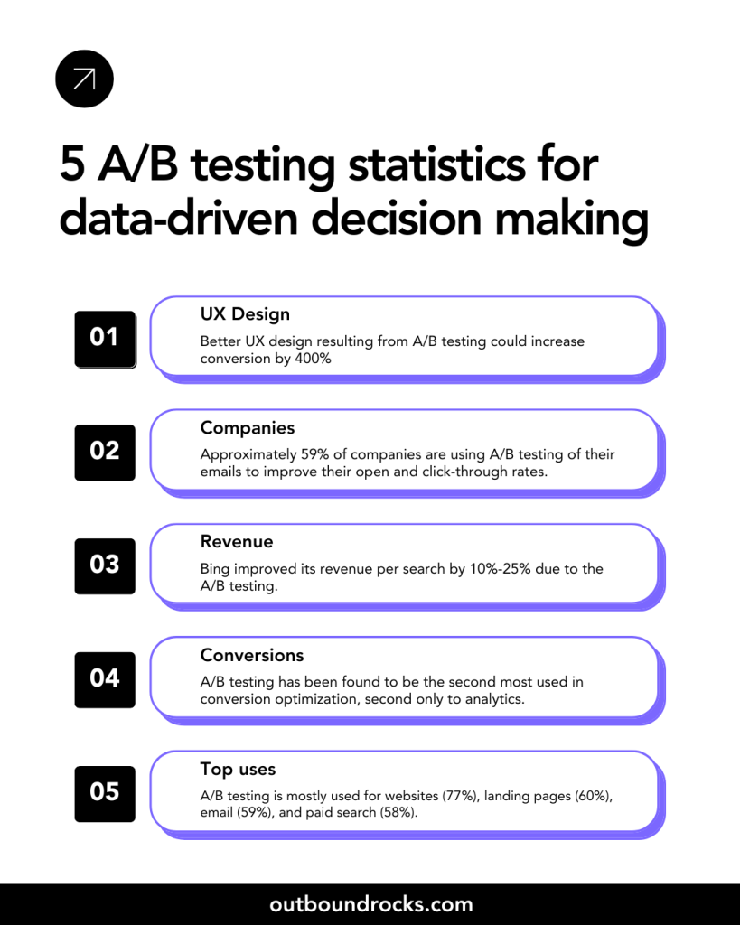
A/B test your CTAs
A/B testing your CTAs is a crucial step in optimising your email campaigns.
Start by testing one variable at a time, such as the text, colour or placement of the CTA. For example, you could create two versions of an email: one with a CTA that says ‘Download Now’ and another that says ‘Get Your Free Guide’.
By comparing the performance of each version, you can determine which wording drives more clicks. Similarly, testing different colours – such as a red button versus a green one – can reveal which colour scheme is more effective at grabbing your audience’s attention.
Placement is another critical factor to test. Experiment with placing your CTA above the fold, in the middle or at the end of the email to see where it performs best. You may find that certain placements work better for certain types of content or audiences.
Conclusions
Call-to-action buttons are essential for driving engagement and click-throughs in your emails and on your website.
By implementing and testing the tips we’ve shared, you’ll be well equipped to create effective CTAs that will boost your campaign performance and deliver better results.
Are you ready to improve your email marketing strategy? Try our free demo today and see how Outbound Rocks can improve your sales funnel, help you connect with your ideal prospects and drive conversions.
Don’t miss this opportunity to optimise your campaigns and unlock your full potential!